Monday 6 October 2014

Jason Deans Art Work

1) This one of the wood piece which he mostly does. He's cut the wood into blocks and used a blow torch to burn the end of the wood. My own opinion on this is that I don't like it that much, his work doesn't excite me enough.


2) This work is also made out of wood but has been slotted into different shapes and looks like barricades on the road. I quite like this work because its different and still exciting.


3) The final image is using press printing and different patterns and marks. he's added different tone to his work to bring out certain bits on his work. I do like this piece because he's made something that can be anything and you could question this work and also its a different image for each person.


This is my own press printing inspired by Jason Dean. I made it using a tea bag since are topic is all about tea. i used a tea bag and made it damp and broke the bag so the tea fell out around the paper, Then I placed it onto brown paper and folded it between newspaper. Further more I used the press printer to stain the pattern onto the paper and heres what my outcome was. I quite like my piece because its easy to see the fallen out tea smudged onto the paper and it looks 3D. I prefer mine over Jason Deans work.

Monday 8 September 2014

WWF Aggressive campaign/Poster

This is my aggressive campaign for wwf. The message behind this is how would you feel if a rhino cut something off you like a nose for example which ou would then think we don't cut rhinos noses off but you will then realize that poachers hunt down wild rhinos and use there horns for sales

Monday 14 July 2014

WWf Final Logo

My final logo! 
my final design logo is bold and is meant to attract peoples attention by standing out and doesn't need much colors. The message is that the rhino doesn't have a horn for the reason that the poachers have taken it off for money.


First step: Remove Rhinos horns on photoshop using the correct tools and layers.


Step two: Then I made two circles and made the middle circle layer white and the outer circle layer black to add affect.


Step three: I then combined the circles together with the Rhiono head and with the text to create my final logo


Monday 23 June 2014

WWF Rebranding

How will I rebrand WWF?
I think the downside to WWF is that they need to be more aggressive with campaigns and with their hole charity in general. I would make a aggressive campaign poster to really catch the audience about animal cruelty. I'd make the campaign dark colors and really bring out the bad side of animal cruelty.

WWF Mind Map

 Heres my WWF mind map! This explains to the audience what you get out of your money and how you can help with some facts and background information!

Tuesday 17 June 2014

Animal rights campaigns! (2)


PETA
PETA is a charity for supporting rights for animals

Animal rights campaign! (1)

WWF
WWF information/about: the WWF have been protecting the future for animals for around 50 years. WWF works in 100 countries and is supported by 1.2 million members in the United States and close to 5 million globally. The leading charity's target audience is most ages mostly young adults because they will know most about animals but its mostly aimed at anyone who cares about the future of our animals.  


RSPCA

They were protecting animals since 1824. They have changed the law in many way such has making cock fighting and cruelty to bears against the law. the target audience is again the same with WWF. Just about anyone that cares for the future of our animals and the difference is people looking to get pets. 

Wednesday 11 June 2014

Tuesday 29 April 2014

Observation Drawing


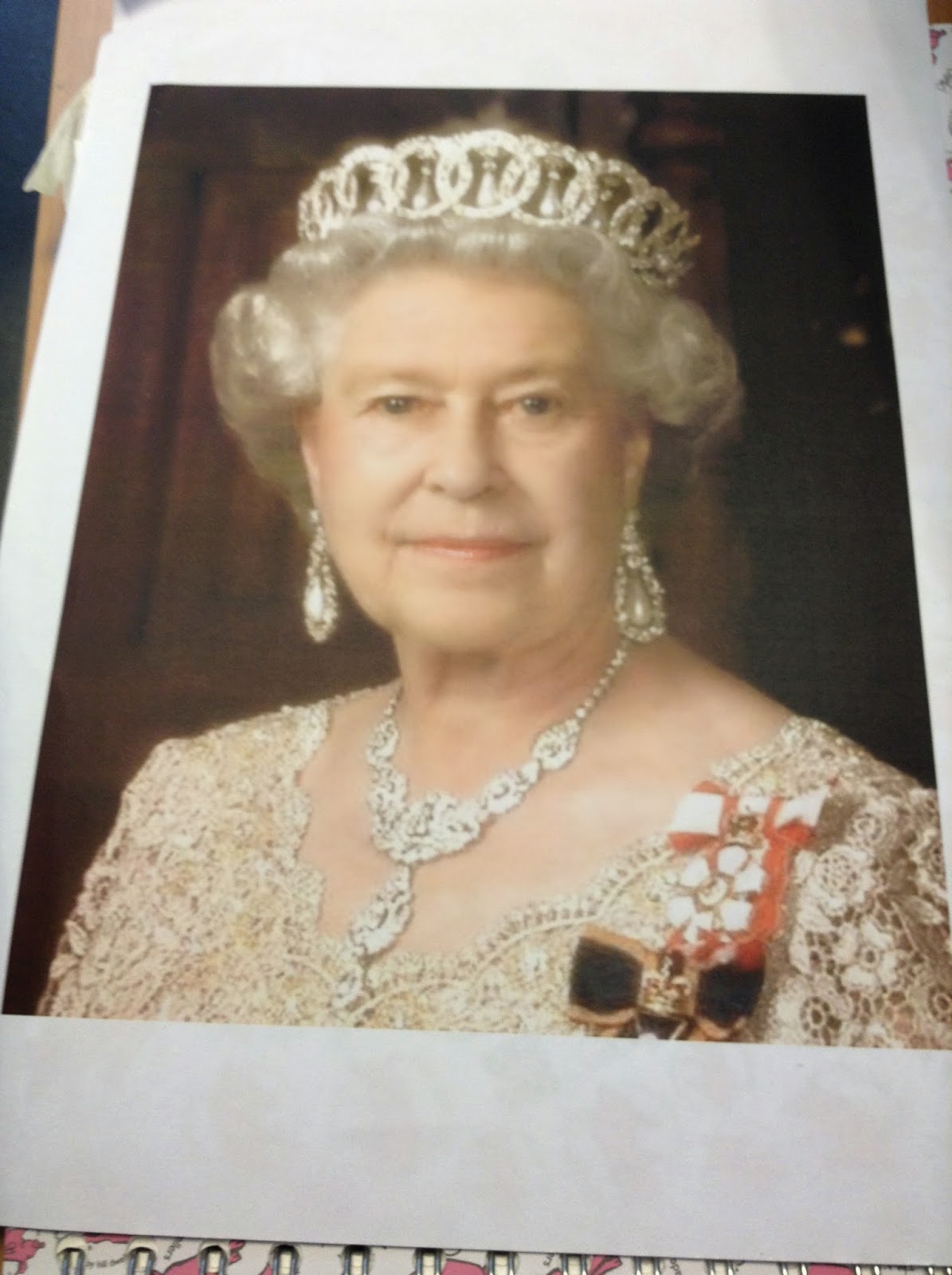
I had to draw a picture of the queen onto transparent sheet on plastic paper but only outline her main features and tones.
Then we placed the drawing onto a colour collage and as you can see the queen looks multi colour

Wednesday 23 April 2014

My collages inspired by Hannah Hoch

These are my collages inspired by hannah hoch, my first one was about dada to practise and my hannah hoch collage had the message behind it of bad education in the world.


My self review
1) ive learned how to make collages with a message behind them.
2) Mixed media is different media such as newspaper, TV, news etc
3) To assemble collages with different meanings to make pictures such as my bad education collage.
4) Yes because I've used different tones of green in my collage to make certain bits brighter.
5) i used any magazine page with green such as holiday islands for green islands and the newspapers to find bad education around the world.

Hannah Hoch

Hannah hocks work

Hannah Hoch was born the daughter of a painter and insurance company manager in Gotha, Germany in 1889.  Hoch attended the College of Arts and Crafts in Berlin studying glass design and graphic arts. Here is some of her work. 
 she makes collages with meaning behind them and it is quite clever in ways. But I'm not a fan of her because i don't see her work as that interesting to me.

Monday 24 March 2014

Stencil Review.

I made my stencil by designing a picture to support anti racism and traced the design on to a cardboard sheet and cut out the detail to make a stencil.


 The work that went the best was work 2. because the brown paper reflects the colors well and it shows the message well because it shows the black and white faces to show the message. i will make some of the features different if i are to make it again so theres less detail.


Wednesday 26 February 2014

Research Banksy!


 I think the message is that there both fighting for the same thing which is peace and kindness. it makes me feel that we don't need to fight because we could make peace another way.


The message shows that he doesn't want money from people he wants all of this to range for the sake of homeless people other than him so everyones equal. this is a very powerful image and makes a lot of people think and might make them help to change.

This image has a massage that quite negative, it clearly says ' follow your dreams' but over it is canceled in bold red colour and the colour red shows anger and negativity. the photo does get you and makes you think of your dreams and if they will happen.
 

Mock Up NHS Smoking Campaign


 On my campaign the jars represent just some of the vile stuff they put in cigarets to put of the viewers, its aimed at teenagers who start smoking but don't understand whats the cigarets are made of. the powerful sentence creates a rhetorical question that stands out more to smokers and they may realize to stop smoking because if the ingredients. and the last picture of the teenager smoking shows that she doesn't just try one of those jars, she's trying all of them in one cigarete.

Wednesday 5 February 2014

NHS aggressive advice campaigns

   These are my NHS smoking campaigns

The image tells us that the smoke from the ciggerate fills up the car and the baby can breath it in, it also shows the ciggarate in front of the baby and focus's on the ciggarate to show the ciggrate is before the baby.              

The image is powerful and very aggressive, it shows us a beaten up man on the outside and it sais " Smoking Batters You Inside" to show what it would look like inside of you if you smoked because we can't see into ourselves.


evaluation colour profiles

evaluation on colour 

1) colour is used to make the reader feel different emotions and feelings to maybe draw the reader in.

2) for example if a poster was red it could make the reader feel aggression or love, red is a very powerful colour.

3) i used colour pastels and smudged in the colour for a good effect, next time i could use paint for a strong sense.

4) the propaganda has bold colors linking with the colour pages and blends well to show more emotion.

Monday 3 February 2014

How color hooks an audience

color 
profiles


 The color red describes power and is aimed at war audiences. The color shower power and fear so it brings an image across. the massage is the russions have power. it shows war public information. to bring fear to there enemies and to whoever gets in there way. the red makes the message 'join the red army' makes them look powerful.


The yellow colour shows energy and stamina. the colour is bright and will catch anyones eye. that the symbol is sharp and scary. it shows fear.


the colour blue shows calmness and hope. its bold and makes the image big.
the message is that there was despair but theres hope with david cameron. the type of public information is showing awareness of him and to say he's right. is sets the mood good and to be happy and proud. the message of the blue is to say he means hope.

Sunday 19 January 2014

Homework, didnt let me log into frog so i didnt know what to fully do sorry.


.


  The photo describes the commercial and the add with a clever line which includes the name. the add is colourful and it will catch anyones eye.

This photo makes you feel as if he need only you so you feel special and join the US army. its plain and is my favourite.
  This photo helps many people becuase it keeps people safe with drinking and it may save lives, its simple and easy. and gets the point across

Tuesday 14 January 2014

jjj
My poppet on public information
 This photo shows that alcohol is bad for you because the glass is shaped like a fat unhealthy person so it shows what will happen if you drink too much alcohol.
This photo is telling adults to join the army. the person is pointing at you so he is telling anyone who looks at it to join the army. also the man looks strong and grown up to show what it would accomplish in the army.